Friday, January 28, 2011

Black and Blue, Again

Well, this was my last attempt at proofing my Domino print before printing in earnest.

I managed to get a deep dark "black" even if this is really a deep purple; it was achieved by printing carbon black, over a rich, very dark purple, over a vermilion red, over a peach/tan.
By burnishing REALLY hard I managed to get out all the little white specks of unprinted paper. (and let it dry unpressed so there are some wrinkles).

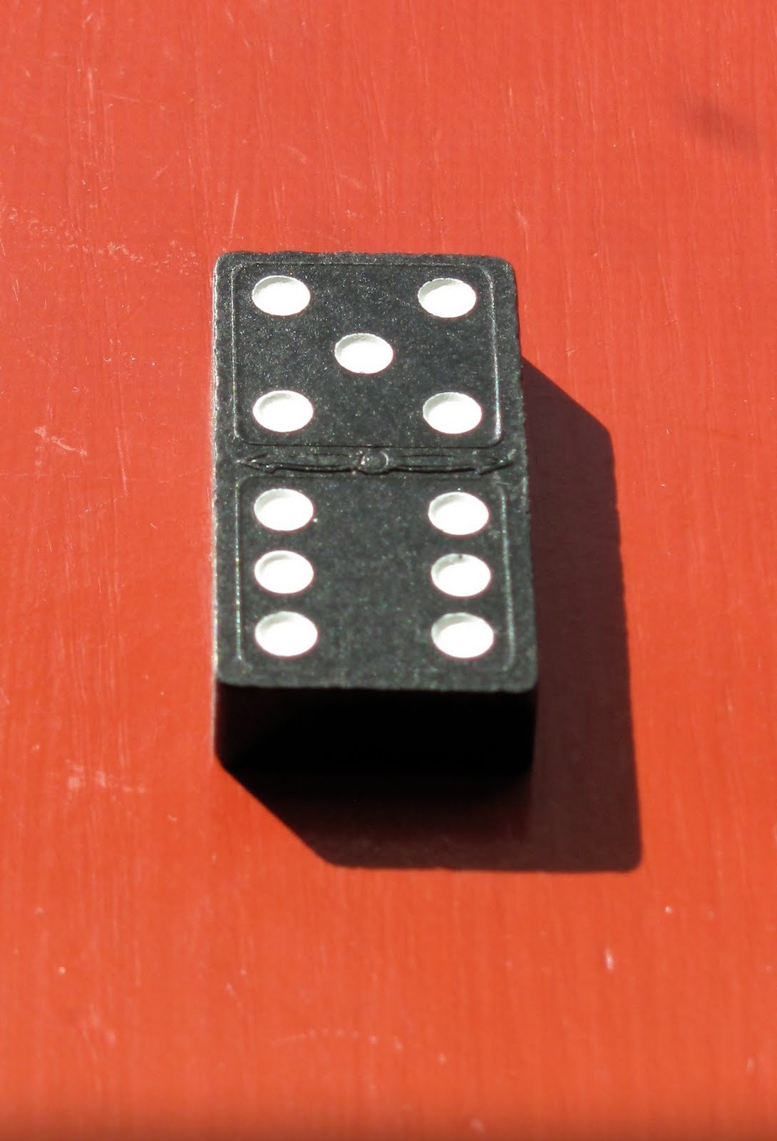
My shadow, while a great color in itself, is too high key and warm and generally wrong for a shadow so it will have to get darker and cooler.

As for the domino body, it's dark and blue-black but maybe not as interesting as the earlier, multicolor trials.

Tomorrow, I'll start printing. I hope to print 50 copies and will probably decide as I'm sitting in front of the blocks, with all my proofs tacked to the wall in front of me, which direction I'll go in. The mood, and final print is greatly controlled by my first color--the background block and that will likely be the most important choice. (I've tried hansa yellow, yellow ochre, pthalo blue green, cobalt blue and this peach (mix of cadmium orange and buff titanium).

But first, and once again, the damp paper, despite my having cleared the blank parts of the blocks carefully is still picking up lots of stray ink and two or three of the blocks will have to be cleared again to prevent spoiling of the final prints.

Tuesday, January 25, 2011

What's the plural of DOMINO?

Well, I've been printing, pulling proofs; like Noah, two by two.

I've been trialing different color combinations and sequences of printing and several different papers. I'm having some issues with the results and while a little late in the game--the blocks are all carved after all--I pull out a REAL domino. I check out the shadows of the little divots/holes again as they don't look quite right in the print. (It's not a real comparison as this domino has divots and the one I drew has hemispherical dots.)


Then back to the studio to print a bit more....

A little more blue, a little more red, A little pthalo green---OOPS--maybe not--overprint some Cadmium Orange to tone that one down--...
The big issue for the moment is my first block is one solid tone except for the white of the dots. Printed yellow, it puts yellow everywhere and that limits the later colors that print over it. The dark shadow of the tile, in my sketch has a vibrant fuchsia in the shadow that--with transparent colors--will be impossible to reproduce if there is a strong yellow underneath. I either have to change colors or carve out the yellow block's shadow area to allow more freedom with the later shadow.


This one's pretty close to what I had in mind--even if it still isn't quite dark enough.
Hmm. Guess I'll have to trim some of those shadows a bit.....

Wednesday, January 19, 2011

Black and Blue and Gray

Well, a dark, rich black is the still elusive goal.
I'm working with transparent, water-based pigments and printing by hand with a baren on handmade, textured paper so it's harder than you'd imagine.
I finished carving the six blocks for the domino print and started try to figure out in what order to print the blocks and how.

Here is a reference trial.
One of my blocks printed with fairly dense, straight out of the bottle SUMI black ink.
It's a warm, inky black and covers very well if you paint it with a brush. But brushed onto the block and printed once it looks like this:


If I brush another layer of sumi and print it again it will get quite a bit darker but the gray tone is the white of the paper showing through--some of it is the texture of the paper and some the grain of the wood. Pressing harder will help.
I could use this as a griseille--a grey value underprinting and then attempt to print colored glazes over the top to achieve the colors I'm after.

The other way to get black is to overprint different colors. The process colors cyan, magenta, yellow and black should give you a dense rich black.


I've roughly tried that here with a yellow background layer, then a warm red, then a cobalt blue (not really cyan but transparent) and then Carbon black in 1) and Phthalo blue in 2. They are still "gray"--there's still too much white paper showing for my taste, but the mood/texture of the dark is to my eye more interesting if still
not black.

Tomorrow I'll switch the order, play with a real cyan/magenta combo and see what happens if I drop the yellow background. Today's printing has shown me that there is still some general trimming and cleaning of the blocks to tighten up the registration and get rid of some stray marks before printing the edition.

Saturday, January 15, 2011

Dominos

Well, enough of all that etching silliness. TIME to get back to woodblocks!
I like to use my woodblocks as a sort of home study course.
I've had trouble getting really dark and rich blacks and the subject of the next print is really just a pretext for this task.
Here's one of the original doodles. The domino originated as a white ivory tile with black pips (ebony wood) but for my purposes I went with the black version--usually black painted wood with white dots. I wanted something black, that I could print in a varied way and still have it be interesting.

My original sketch was of a domino with a six and a one but then, at the food store I saw this....and was crushed.
I thought about changing paths/ideas--especially as this one is a bit thin, content-wise. But after waffling and postponing, I finally just charged ahead.
Drinking some of the bottle helped. It's not bad. So I went back to the sketchbook and tried again:

This is the preparatory drawing for the blocks, colored in with colored pencils.
The liveliness comes from the handling of the color; in this case I've colored in using black, over red, over ochre, over yellow, each time laying color on the paper and the rough oak table underneath imparts an irregular surface to the color.
Achieving this kind of color/liveliness/richness with water based, transparent pigments in a block print is the challenge. I'll need several blocks and have to print each multiple times to achieve anything near this interesting....we'll see...

I glued my hanshita's down and started carving. I finished the keyblock last week; blocks 2 and 3 tonight.
Should be able to get the next three carved tomorrow?

Tuesday, January 11, 2011

Dust Bunny

8" x 10" Soft ground and sugar lift etching with color aquatint

The owner of the braid of the last two posts leaves these things each time she brushes her waist-length hair. She leaves them as little gifts on a desk, in a wineglass or tucked into an envelope like some precious little secret note.

And they are charming, in a kind of old-relic, church-remnant sort of way. We now both sort of collect them; I hope eventually to fill a large bell jar with the cast off tumbleweeds around a small suspended marble figure floating in the middle like a fetus in a hairy amniotic sac.

This print was so much fun to make.

Plate 1: 6" X 8" polished copper. Sugar lift/aquatint--even the name is cool.

A single fat brush stroke towards the bottom of the plate was drawn using a karo sugar syrup/india ink solution and allowed to dry.
Then a turpentine/asphaltum mixture was painted over that. It coated the rest of the copper plate to protect it from the acid. Once dry, the whole plate was placed in warm water and the sugar/karo brush stroke was dissolved out leaving the bare metal. This was placed in the acquatint box--depositing a thin layer of powdered rosin over the brush stroke. Heated gently in an oven, it sort of melted in a pebbly,uneven fashion so when the plate was placed in the acid (30seconds) the result is a gently etched perfect brush stroke that will print at the bottom of the print.

Plate 2: The hairball. Soft ground etching. I rolled a warm, waxy, soft resist across the whole second plate and then placed a thin piece of paper on top. Using a dull pencil, I scribbled all the lines on the paper. They pressed into the soft wax-like resist which stuck to the paper where the lines were drawn.
Lifted off they left the impression of my drawn squiggles which when placed in the acid (30 minutes) ate where the lines had exposed the metal. These etched lines would then hold the ink when the plate was inked and printed.

These were printed in sequence; First a nice lavender shadow/brush stroke for plate 1
Followed by a brown/black for plate 2.

Simple/complex--maybe not quite hairy enough....


Hairball, etching and aquatint, chine colle'
8" X 10"

Monday, January 10, 2011

copper braid

I'm not far from San Francisco and when a colleague mentioned that Crown Point Press was having a weekend etching workshop I jumped at the chance. One of the premier fine art printing/publishing studios of mostly conceptual/visual artists' work in prints, it meant having access to their amazing studio and help from two master printers.

Since I've been having lots of trouble with my blue press--I need some help with the hands-on part--how to ink and wipe a plate, registration, multiple plate registration, etc. SO I drove up and spent two days and it was exhausting but loads of fun. It's an impressive set up; with separate rooms for acquatint, and acid etching, great lighting, OSHA regulation ventilation and safety features and all the tools and techniques available to help you produce whatever you'd like.

Soft ground, hard ground, spit bite, aquatint, flat bite, chine colle', drypoint, engraving, sugar lift, etc. etc.
Too much for just two days.

I decided to work loosely from my previous figure drawing hoping to be able to play with technique rather than fret about image and detail. I loosely traced my image outlines hoping to work on the braid in line and color as the main subject.


The initial line drawing was reproduced with soft-ground etching giving me nice, hand-drawn quality lines to the contours and basic braid and hair shapes.

Then I blocked out the figure and did a simple aquatint of the background shapes to set them back by making them flat and darker.

Next, I went back in a reblocked the figure and step-etched using aquatint the hair several times to get different tones, once blocking out with a sharpie before going back in the acid bath.

The second one was printed using a burnt umber/black mix; both on white Somerset paper using Charbonel inks.

I'm mostly happy with how it came out. I was hoping for something a bit looser and I wanted the subject really to be the braid. The drawing is a bit off/not quite naive or accurate enough but I like the way the hair came out. I'll probably still go back in with my drypoint needle and add some more wispy hairs but it's mostly done.

Monday, January 3, 2011

La Sposa


There was a time when you wouldn't undress before me.
But that was years ago.
Maybe you're finally comfortable with my presence.

Maybe after all this time you no longer see me before you
Or can't hear my breath or footstep
Or just can't be bothered any longer with modesty and shyness.

Maybe you know that I will always find you beautiful,
And find my gaze so natural and normal as to be like the beating of your heart
Something of which we are almost unawares
Unless it goes faster
Or skips or stops.

Sunday, January 2, 2011

Rimproveri (Reproaches)


I am a frustrated farmer and left Italy some years ago very reluctantly.  When, in 2000, we moved back to my wife's family home, I tried to revive an abandoned farm on the surrounding acreage. But hampered by my inexperience and tethered by family responsibilities I didn't do such a good job of it. But it was something I took very seriously and still feel was one of the few times of my life I was doing something really important.  The fields had been cultivated heavily for centuries and the last 50 years had been hard. The loss of the farm animals and subsequent heavy instrument/tractor farming by itinerant farmers had really depleted the land and weakened the soil.

I tilled the soil, double dug vegetable beds, imported tons of manure and compost and started trying to fix things. I pruned the olives and old fruit trees back into production. I started tending the small vineyard and made oil and juice and wine with the fruit. Planted many heirloom old fruit tree varieties, french strawberries, American pumpkins and sweet corn.  We ate well but never made any money and we traveled too much to ever really make it work. New farms like most new businesses do not tolerate absentee owners and much of what I planted died. We moved back to the USA in 2008 and I left fruit hanging on the vine--no wine to be made that year.

It's always hard to go back.  I remember much of what I planted, where things went and what they should look like now after another year away--but it's always a shock to see how much things have changed;  I walk the fields and see so many errors of judgement and promises broken.
Empty fields--planted to clover and vetch, borage and rye now sprouting instead with dock and thistles--plants that will slowly take over and later be hard to be rid of.

But it was the grapes this year that were the saddest.


Someone, wisely, had covered them with netting to keep the birds out--it's a small vineyard and they'll slowly eat them all as they ripen left to their own.
But the grapes  never got picked and the netting never got taken down.
These are the mummies.
Moldy clusters of once yellow and gold; black and purple fruits.
They never got to the table or the press and only their names remain things of beauty.
These are Malvasia and Trebbiano, San Giovese and Canaiolo.

Or they were.  It would have been better to have left them to the sparrows and blackbirds.
If I had the energy, I'd take down the nets; cut off and burn the moldy fruits, prune back the vines in anticipation of next year.....
But I'm already gone.